“The details are not the details. They make the design.”

Detail: endpaper from The Desire of Ages
The Design Story
As a design studio we care deeply about creating remarkable experiences. We labor over the details because we understand that the end product is simply the sum of all these small decisions.
Design Philosophy
Since these books deal with such a rich and meaningful narrative, we were interested in basing design concepts on the ideas, stories, and truths presented in the books themselves. We drew from the geometry of the tabernacle, the color of the materials, and the life and death of Christ in making our decisions.
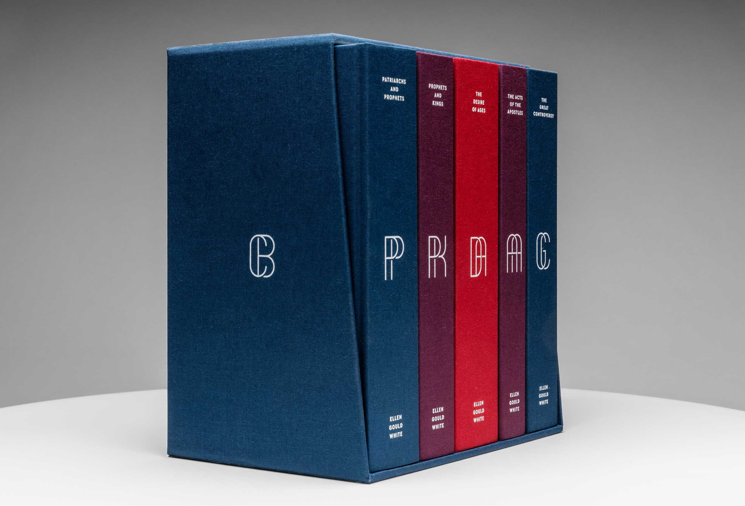
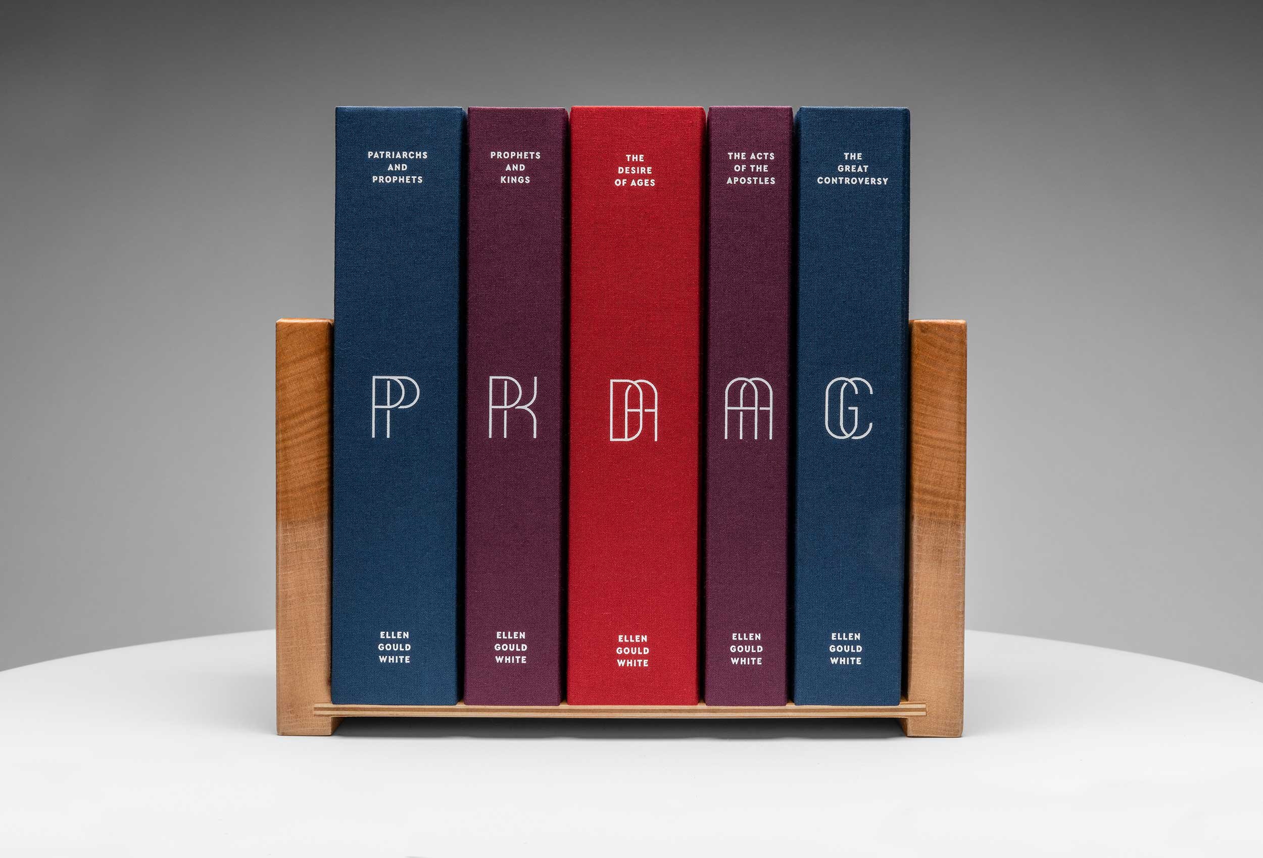
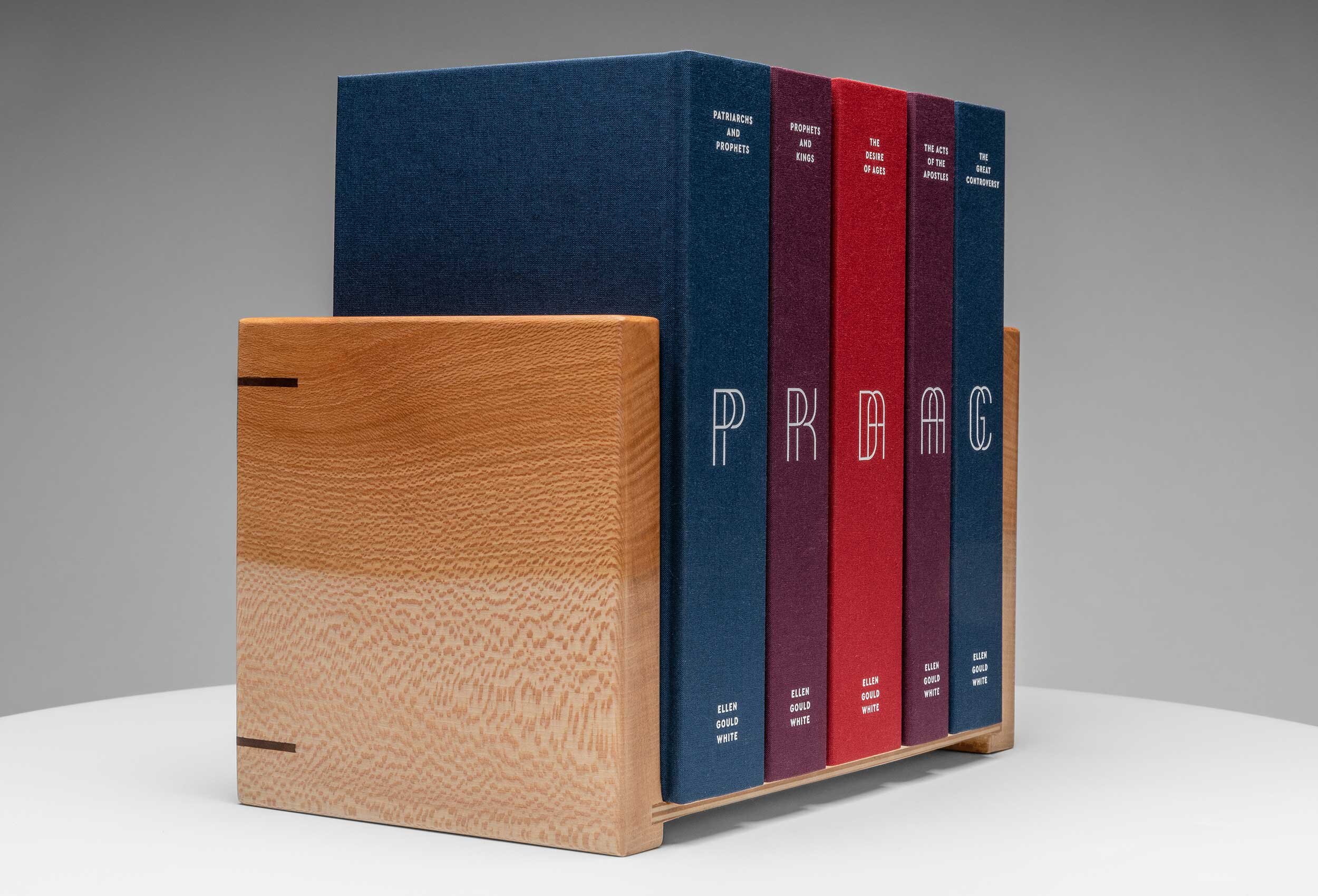
Monograms
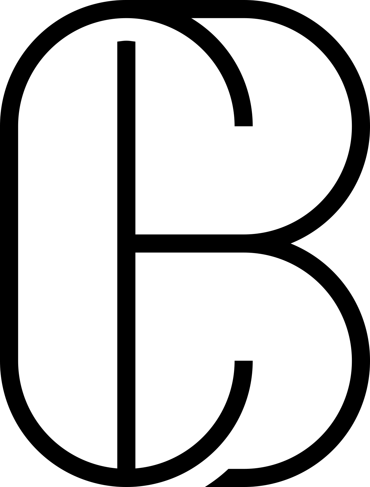
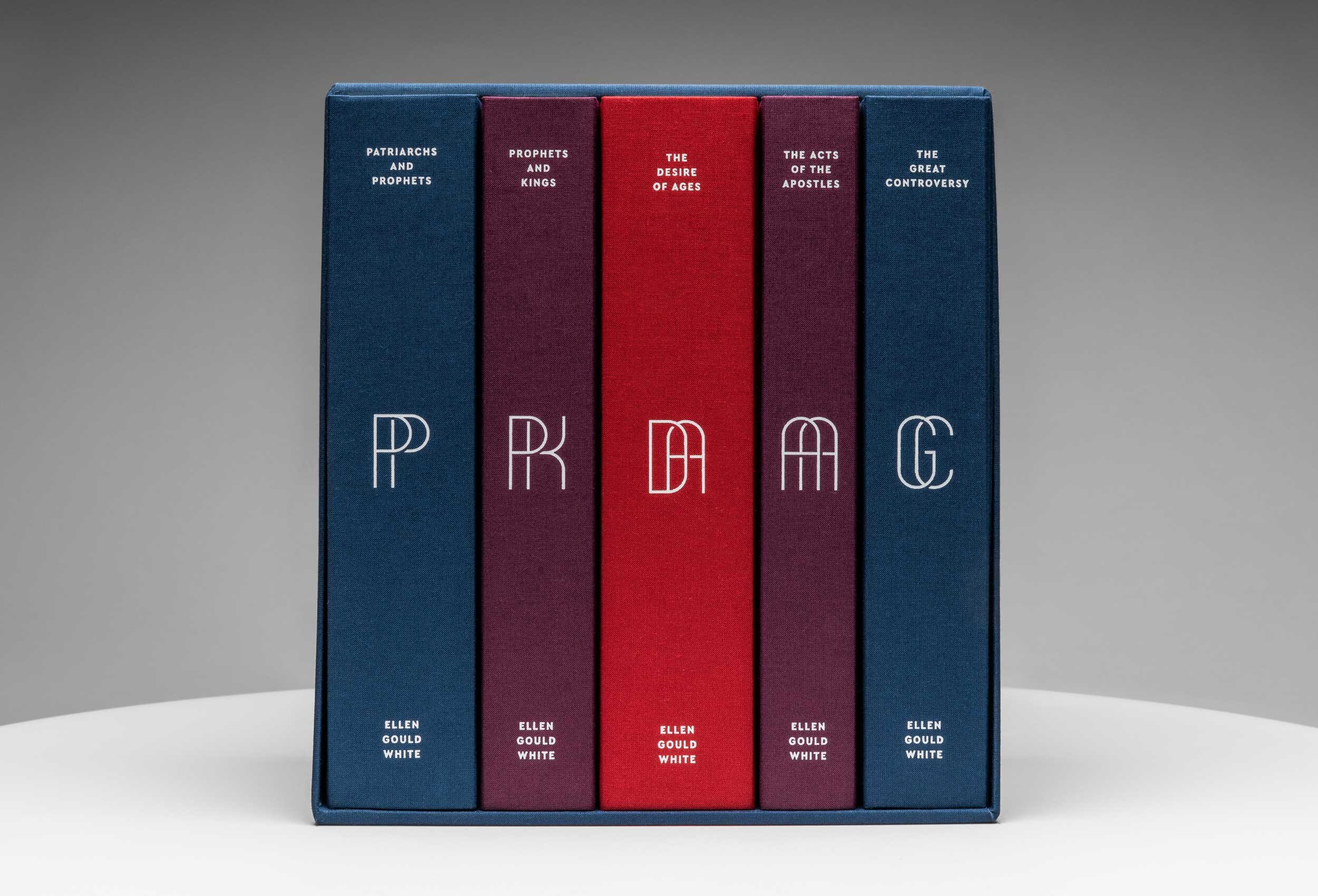
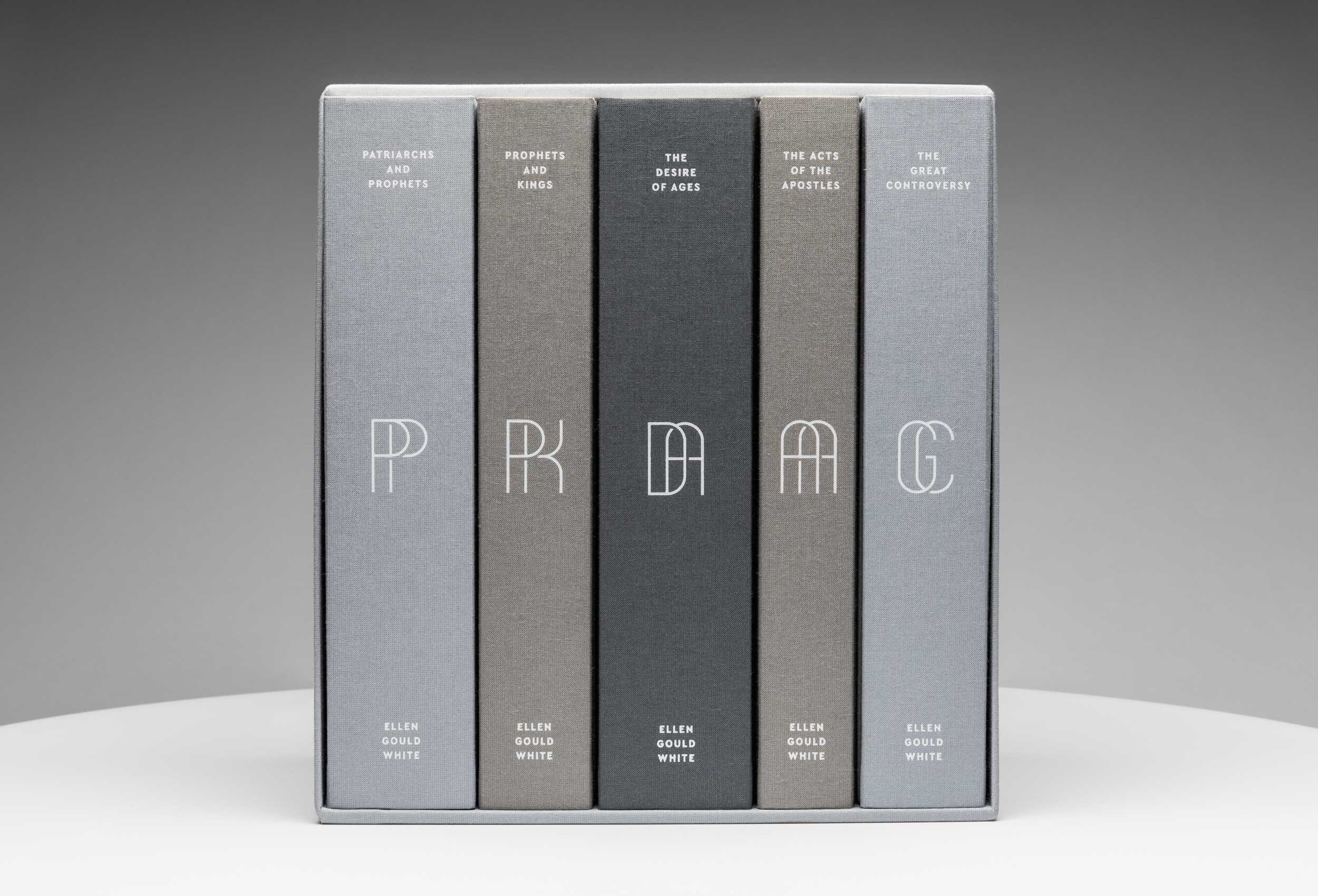
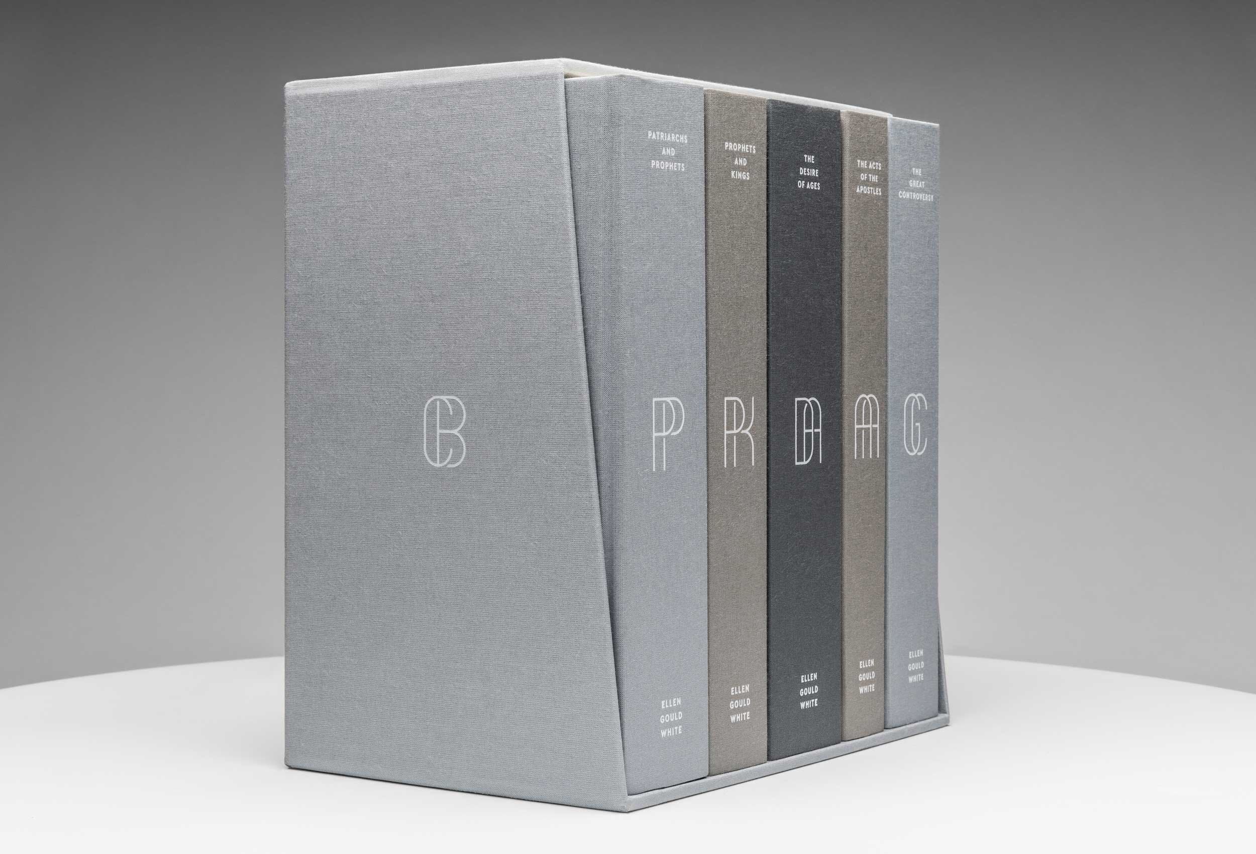
To a lot of people familiar with these books, they have become known by their acronyms: PP, PK, DA, AA, and GC. In exploring design options for the different books, we became interested in elevating those acronyms in the design, so we created custom letterforms for each book.
Each letterform has been designed using the shapes found within the sanctuary. The Outer Court and Holy Place are rectangles using a 2:1 ratio; The Most Holy Place and Altar are perfect squares, and the Laver is a circle.
Color
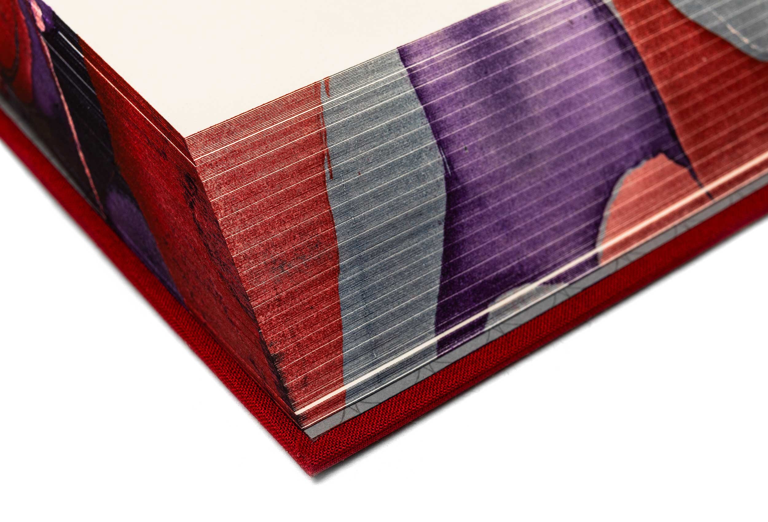
The Conflict Beautiful is being produced in two distinct cover bindings—an elegant grayscale, hinting at the struggle between light and dark, and a sanctuary palette, a bold set of scarlet, purple, and blue.
Chiastic Structure
In both cover bindings, the books are organized using a chiastic structure, which was a very common literary device used throughout the Bible. Essentially, the most important content is in the middle with the content before building to it and the content after mirroring that process in reverse. So The Desire of Ages (Ellen White’s book on the life of Christ) becomes the focal point in The Conflict Beautiful.
original page numbers
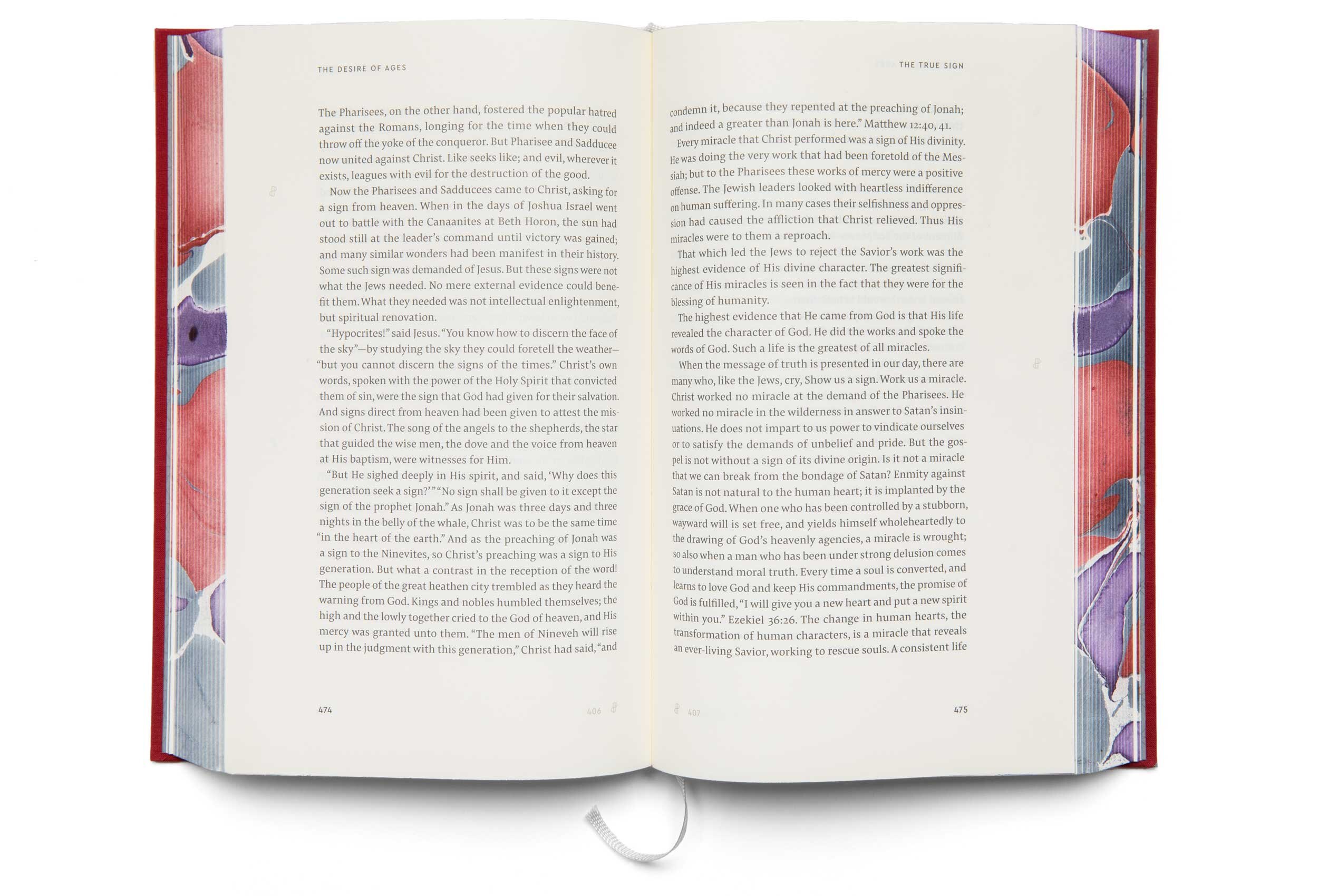
Most Ellen White books maintain the page numbering found in the original editions, making her writing easy to cite. Turn to page 350 in any copy of The Desire of Ages, and you will find this quote: “During His ministry, Jesus devoted more time to healing the sick than to preaching.” This is extremely valuable, but it also restricts the design of the page, affecting typography, margins, font size, page size, and, ultimately, readability.
Dual-Page numbering
To address this issue, we created dual-page numbering. The numbers in black along the bottom of the page are the page numbers for The Conflict Beautiful; the numbers in gray are the page numbers in the original editions of the books. The symbols in the outside margin are page marker symbols that show the beginning of the original-edition page listed in gray type at the bottom of the page. The page marker symbols indicated the beginning of the first complete paragraph of that new page; to look up or cite a passage from a subsequent paragraph, simply count the paragraph breaks that come after the symbol.

Interior spread showing page numbering and typography
Typography
When it comes to book design, a really great typeface is one you don’t even notice. Your eyes glide across the page effortlessly moving from letter to letter, word to word, and line to line. This might sound simple, but designing a typeface that does all those things well is extremely difficult. After extensive exploration we decided to use Pensum Pro, a beautiful highly readable font family designed by TypeMates, a foundry located in Germany.
Paper
The paper used on the interior is made by Salzer. It’s silky smooth to the touch, ink sits beautifully on the page, it’s acid-free, chlorine-free, non-yellowing, has a high opacity, and best of all it’s entirely wood-free. This is a premium paper made specifically for books, and we think you’re going to love it as much as we do.

Detail: typography
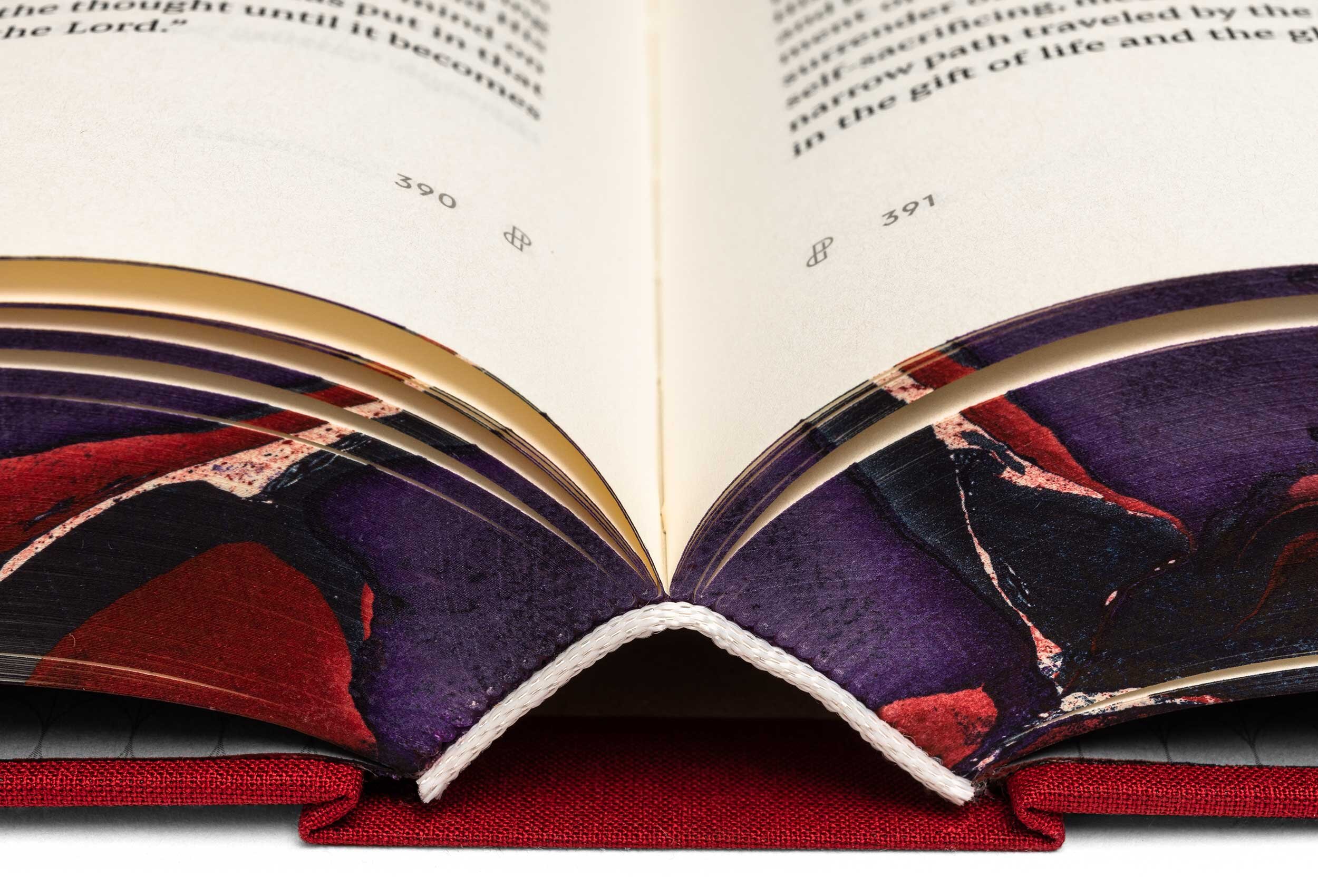
Smyth Sewn Binding
Smyth Sewn binding is the highest quality binding technique available. Each page is physically sewn in, resulting in a book that will stand up to heavy use over many years. Smyth Sewn books are also a pleasure to read from because they open flat making it easy for reading, highlighting, or jotting your notes in the margin.

Detail: Smyth Sewn binding
Fabric Slipcase
Every set of The Conflict Beautiful is delivered in a custom slipcase that’s wrapped in the same cloth that’s used on the covers of the books, and angled back to assist in removing and replacing the books.
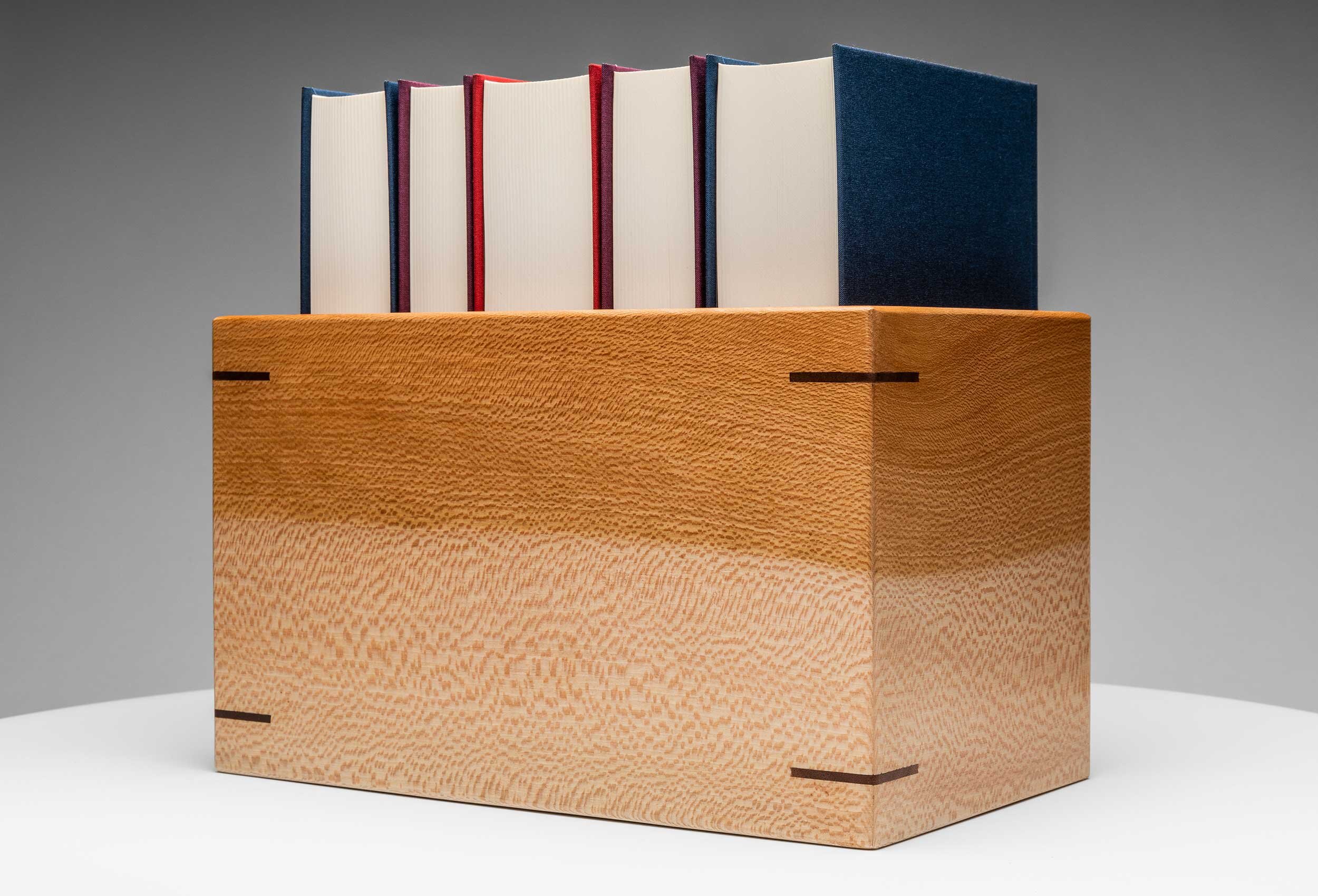
Sycamore Case
We designed a custom solid sycamore case to contain The Conflict Beautiful and allow for easy access, storage, and display. Hand-crafted by an artisanal woodworker in southwest Michigan, each slipcase is expertly constructed to be a high-quality complement to the books.
Why sycamore? We’re happy you asked. Just like Zacchaeus climbed a sycamore tree to get a better view of Jesus, these books are all about giving readers a more accurate view of Christ.
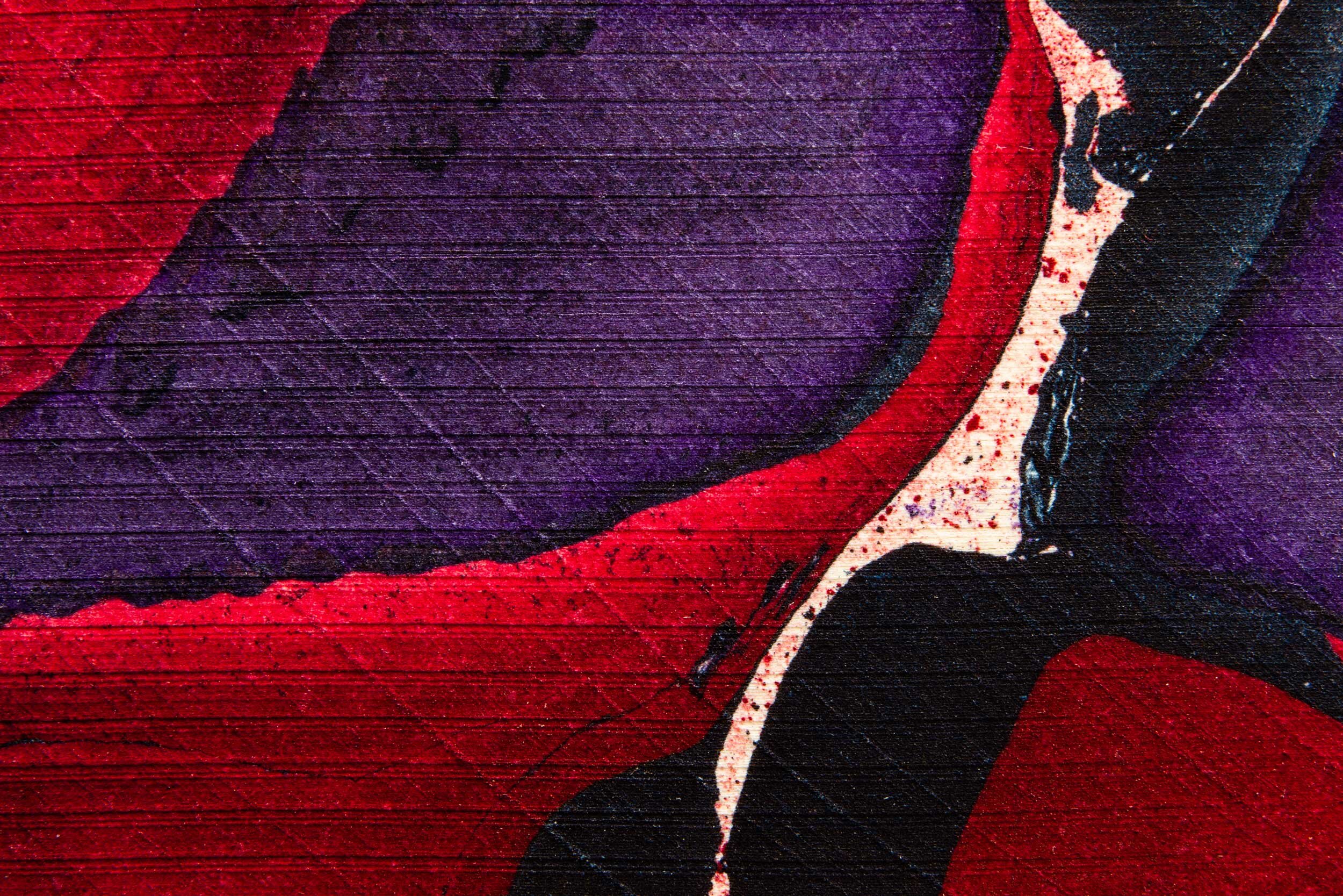
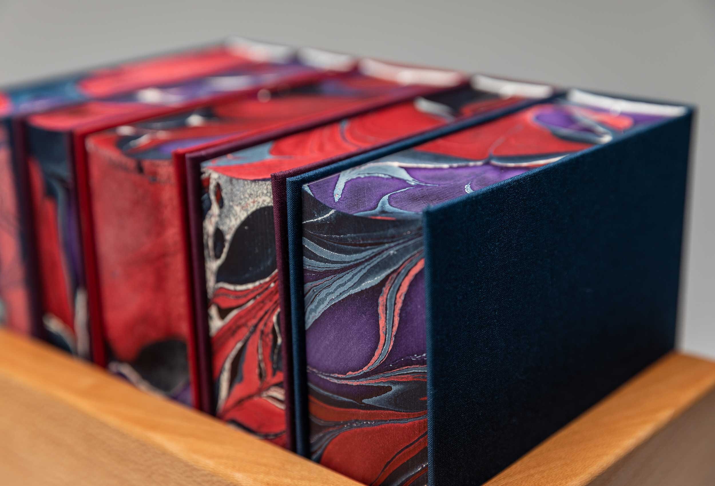
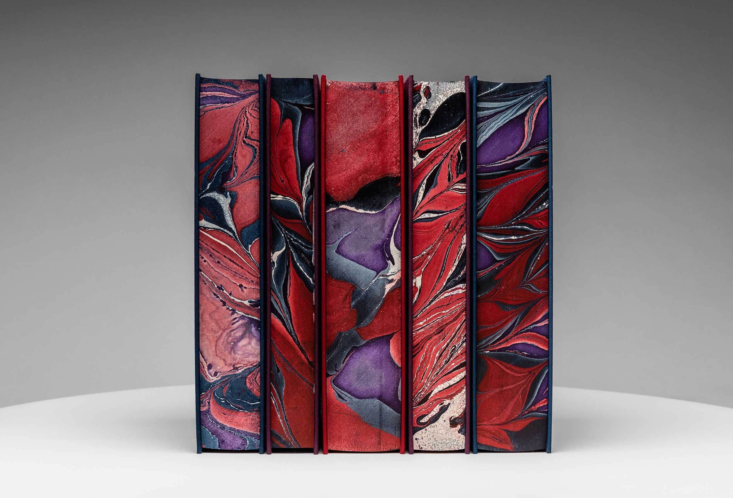
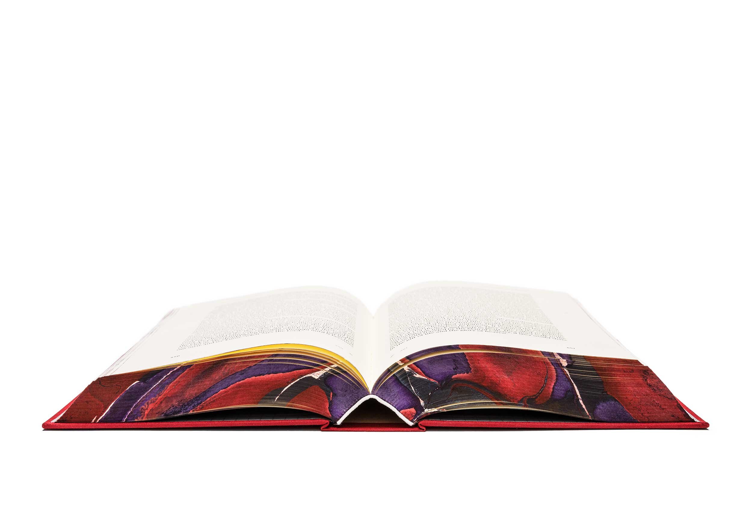
Marbled Page Edges
We worked closely with a master artisan at Kösel to create a limited number of sets with marbled page edges (unfortunately these are completely sold out). Each book was dipped one at a time into marbled ink resulting in a completely unique marbling pattern every time. Some of the earliest editions of Ellen White’s books employed this technique, and we like how it visually hints at the conflict depicted within her writing.

Printing
The Conflict Beautiful was printed by Kösel in Germany—a manufacturer that has been making beautiful books for over 400 years. Their expertise and attention to detail is apparent as soon as you hold one of their books in your hands.